

How to Build a Responsive Website

In today’s digital age, having a responsive website is no longer optional. It’s essential. Whether you’re a beginner or just exploring web designing, this guide will walk you through every step of building a responsive website from scratch using modern practices.
Table of Contents
- What is a Responsive Website?
- Why is Responsive Web Design Important?
- Tools You Need to Get Started
- Understanding HTML and CSS Basics
- Planning Your Website Layout
- Writing the HTML Code for Website Design
- Styling with CSS for Responsiveness
- Media Queries and Breakpoints
- Responsive Images and Media
- Testing Responsiveness
- Optimizing for Performance and SEO
- Common Mistakes to Avoid
- Final Thoughts
1. What is a Responsive Website?
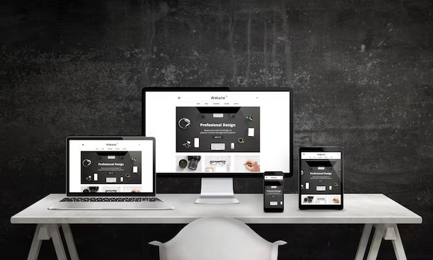
A responsive website is a type of website that automatically adjusts its layout, images, content, and overall structure to provide an optimal viewing experience across a wide range of devices — from large desktop monitors to laptops, tablets, and smartphones.
In simpler terms, it means your website looks good and works well whether someone is browsing on a phone, tablet, or computer.
Why is Responsive Web Design Important?
Imagine visiting a website on your phone where the text is tiny, images are cut off, and you have to zoom and scroll sideways just to read content. That’s the opposite of responsive web design. A responsive website fixes all that by:
- Adjusting fonts for readability
- Scaling images appropriately
- Stacking or rearranging content for smaller screens
- Providing a smooth and seamless user experience across all screen sizes
This adaptability is what makes responsive web design a critical part of modern web designing.

How Does a Responsive Website Work?
Responsive websites rely on a combination of smart techniques and coding strategies to make the site behave properly on any device. The three core components of responsive web design are:
1. Flexible Grid Layouts
Rather than using fixed pixel sizes, responsive sites use percentage-based layouts. This allows elements to resize in proportion to the screen size. For example, a website section may be designed to take up 50% of the screen on desktop and 100% on mobile.
2. Flexible Media (Images & Videos)
Images and videos in a responsive layout scale to fit the screen or container without overflowing. You can achieve this with CSS properties like:

3. CSS Media Queries
Media queries allow developers to apply different styles depending on the device characteristics (like width, resolution, or orientation). For example:

This line of code ensures that the navigation bar switches to a vertical layout on smaller screens — a perfect example of responsive design in action.
SEO Benefits of Having a Responsive Website
Search engines like Google prioritize mobile-friendly and responsive websites. Here’s how a responsive design helps your SEO:
- Improved User Experience: Users stay longer on a site that looks and works great on all devices, reducing bounce rate.
- Mobile-First Indexing: Google primarily indexes the mobile version of your site, so responsiveness directly affects your rankings.
- Faster Load Times: Responsive websites are optimized for performance, improving Core Web Vitals.
- Single URL for All Devices: No need to build separate mobile versions, making link sharing and indexing easier.
2. Why is Responsive Web Design Important?
In today’s digital world, responsive web design isn’t just a nice-to-have — it’s a must-have. With more than 60% of global web traffic coming from mobile devices, creating a website that works only on desktops is a surefire way to lose traffic, leads, and customers.
A responsive website ensures that your content, layout, and features adapt seamlessly to every screen size — from smartphones and tablets to laptops and large desktops. This flexibility translates to better user experiences, improved search engine rankings, and higher conversion rates.
Let’s break down the core benefits of responsive web design and why every modern business, blogger, or developer should prioritize it:
A. Improved User Experience (UX)
A well-designed responsive website offers users a consistent, intuitive, and enjoyable experience, no matter what device they use. No zooming, no horizontal scrolling, no broken layouts — just clean and accessible content.
Why it matters for SEO:
Google tracks user engagement metrics like bounce rate and time on site. A poor experience drives users away, negatively affecting your rankings.
Fact: 61% of users are unlikely to return to a website they had trouble accessing on mobile — and 40% will visit a competitor instead.
B. Faster Page Loading Speeds
Page speed is a critical SEO factor. Responsive websites typically load faster, especially on mobile devices, because they:
- Avoid redirects to mobile versions
- Use optimized images and CSS
- Serve a single HTML file per page
Why it matters for SEO:
Slow websites lead to higher bounce rates. Google’s Core Web Vitals directly evaluate how quickly your page loads and responds to user interaction.
A 1-second delay in mobile load time can impact conversion rates by up to 20%.
C. SEO Benefits – Google Recommends It
Google has officially stated that responsive web design is the recommended mobile configuration. Since mobile-first indexing became standard, Google primarily uses the mobile version of your site for indexing and ranking.
What this means for your site:
- A responsive site will rank better than a non-responsive one.
- You won’t face duplicate content issues (unlike separate mobile sites).
- There’s only one URL per page, making it easier to manage backlinks and analytics.
Bonus Tip: Having a mobile-friendly and responsive layout increases your chances of appearing in Google’s mobile search features, like Top Stories and local pack results.
D. Cost Efficiency – One Site for All Devices
Maintaining multiple versions of a website (e.g., desktop + m.domain.com) is costly and time-consuming. With responsive web design, you only need to design, develop, and maintain one single website.
Benefits include:
- Lower development and maintenance costs
- Faster updates and testing
- A consistent brand identity across devices
Businesses save both time and money with responsive design — while delivering a better product to their users.
E. Higher Conversion Rates
A better user experience + fast performance = more conversions.
Whether your goal is selling a product, collecting emails, or encouraging sign-ups, a responsive site ensures visitors can easily navigate and take action — regardless of the device they use.
How responsive design boosts conversions:
- Clear, tappable call-to-action buttons
- Simplified mobile-friendly forms
- Smooth navigation and layout transitions
3. Tools You Need to Get Started
Code Editors – Where You’ll Write Your HTML, CSS & JavaScript
Your code editor is your digital workspace — where you’ll write, edit, and manage your files for building websites. Modern code editors support syntax highlighting, live preview, auto-completion, and extensions to make your responsive web design journey smooth and efficient.
1. Visual Studio Code (VS Code) – Most Recommended

Features:
- Free and open-source
- Built-in terminal for running commands
- Extensions for HTML, CSS, JavaScript, and frameworks
- Git integration
- Emmet support for faster HTML code snippets
Use extensions like “Live Server” to test your responsive HTML code for website design in real-time across different screen sizes.
2. Sublime Text – Fast & Lightweight
Sublime Text is another popular editor that’s ideal for those who prefer speed and simplicity.
Features:
- Minimal UI and lightning-fast
- Multi-cursor editing
- Plenty of plugins via Package Control
Note: Sublime is great for HTML/CSS-focused projects where simplicity is a plus.
Browsers for Testing Responsiveness
Creating a responsive website is not just about writing code — it’s also about testing how your layout adapts to different screen sizes, devices, and browsers.
Testing across multiple browsers ensures your web design looks and performs consistently for all users.
1. Google Chrome (with DevTools)
Chrome DevTools is a goldmine for testing responsive web design. With built-in mobile emulation, you can preview how your website appears on iPhones, Android phones, tablets, and more.
Key Features:
- Device toolbar for responsive testing
- Performance auditing with Lighthouse
- Real-time editing of HTML/CSS
- Mobile throttling to test page speed
2. Mozilla Firefox (Developer Edition)
Firefox’s Developer Edition includes tools tailored for front-end developers, especially when testing CSS media queries and layout responsiveness.
Key Features:
- Grid and Flexbox inspectors
- Responsive Design Mode
- CSS debugging tools
- Privacy-focused testing
Optional but Powerful Tools (Highly Recommended)
While not strictly necessary to start, these tools can significantly speed up your workflow and improve your overall web designing process.
Git & GitHub – Version Control & Collaboration
Version control is essential for tracking changes and collaborating with others. Git and GitHub are industry standards.
Benefits:
- Backup your code online
- Collaborate with team members
- Revert to older versions easily
If you’re building personal or client websites, hosting source code on GitHub boosts credibility and can be used to showcase responsive website projects in your portfolio.
Figma or Adobe XD – Design Before You Code
Wireframing and designing your layout before jumping into code ensures a smoother development process. These tools let you plan your responsive web design with drag-and-drop functionality and pixel-perfect previews.
Figma Advantages:
- Cloud-based with real-time collaboration
- Responsive layout previews
- Design-to-code handoff for developers
Adobe XD Advantages:
- Integration with other Adobe tools (Photoshop, Illustrator)
- Vector-based UI/UX designing
- Works offline
Designing your site first helps visualize layout transitions on different screen sizes — a critical part of building a truly responsive website.
Bonus Tools to Explore
| Tool | Purpose | SEO Benefit |
|---|---|---|
| Can I use | Browser compatibility checker | Ensures your design works on all devices |
| Lighthouse | Performance, SEO, and accessibility audit | Optimize for search engines |
| Prettier | Code formatter | Clean code improves load speed |
| Responsive Checker | Online tool to test responsiveness | Verify across screen sizes instantly |
4. Understanding HTML and CSS Basics
Before you start building your responsive website from scratch, it’s important to understand the core technologies that power every web page on the internet: HTML and CSS. These two are the foundation of web designing, and mastering them is the first step toward creating a visually appealing, functional, and responsive website.
Whether you’re designing a simple portfolio or a full-scale business site, you’ll use HTML code for website design to create the structure and CSS to control the appearance and layout — especially when adapting to different devices and screen sizes.
What is HTML? (HyperText Markup Language)
HTML is the standard markup language used to create the structure of a web page. It tells the browser how to display content like:
- Headings (
<h1>to<h6>) - Paragraphs (
<p>) - Images (
<img>) - Links (
<a>) - Lists (
<ul>,<ol>) - Forms and input fields
Think of HTML as the skeleton of your website. It defines what is shown on the page, but not how it looks — that’s where CSS comes in.
Example HTML Snippet:
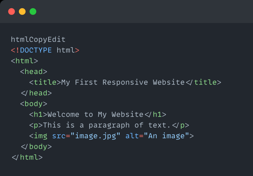
This basic code sets up a web page with a title, heading, paragraph, and an image.
What is CSS? (Cascading Style Sheets)
CSS is what makes websites look beautiful and usable. It controls the style, layout, and visual appearance of your HTML elements.
With CSS, you can define:
- Colors
- Fonts and typography
- Spacing and padding
- Borders and backgrounds
- Responsive layouts using media queries
CSS is crucial for responsive web design, allowing you to make sure your layout adjusts seamlessly across devices.
Example CSS Snippet:
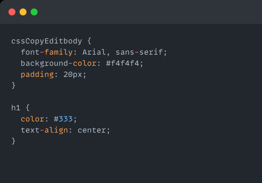
This simple CSS applies a background color, sets the font, adds padding, and styles the heading — all essential parts of a clean, modern responsive website.
How HTML and CSS Work Together
- HTML defines the structure of a webpage.
- CSS defines the style and layout of that structure.
- Combined, they form the visual and functional base of any responsive website.
For example, if you use HTML to create a navigation menu and CSS to style it into a horizontal layout — then you can use CSS media queries to make that menu vertical on smaller screens, which is a key part of responsive web design.
Why Learning HTML and CSS Is Crucial for Responsive Design
To build a mobile-friendly, fast, and SEO-optimized site, you must understand how to write clean HTML and use CSS strategically. It helps you:
- Create mobile-first layouts using media queries
- Avoid inline styles that slow down page speed
- Build accessible content with proper HTML tags
- Design layouts that scale fluidly across screen sizes
Pro Tip for Beginners
Use semantic HTML elements like <header>, <nav>, <section>, and <footer> instead of just <div>s. They help improve accessibility and SEO, which is great for search engine visibility and user experience.
SEO Benefits of Proper HTML & CSS Use
- Clean HTML structure helps search engines understand your content.
- External CSS files make your site faster, improving page load time (a Google ranking factor).
- Responsive CSS techniques like
flexbox,grid, andmedia queriesmake your site adaptable to all devices — another ranking booster.
5. Planning Your Website Layout
Before writing a single line of code, it’s critical to plan your website layout. This step isn’t just for designers — it’s essential for developers and content creators too. A clear layout structure helps you design a smooth user experience, organize content logically, and ensure your site is both visually appealing and responsive on all devices.
When building a responsive website from scratch, planning helps you visualize how your content will flow across different screen sizes — from widescreen desktops to mobile phones.
Start with Sketching or Wireframing
Wireframing is like creating a blueprint for your responsive website. It maps out where each section will go, helping you focus on functionality and layout before getting lost in colors, fonts, or animations.
You can sketch on paper or use digital tools like Figma, Adobe XD, or Balsamiq.
Wireframes are especially important for responsive web design because they help you anticipate how elements will stack, resize, or rearrange on smaller screens.
Key Sections to Include in Your Responsive Layout
Here’s a basic page structure used in most modern web designing workflows. These sections can be adapted for any type of website — business, portfolio, blog, or eCommerce.
1. Header with Navigation
- Should be clear and consistent
- Logo on the left, navigation links on the right (or center)
- Add a hamburger menu for mobile views (responsive-friendly)
- Include key links: Home, About, Services, Contact
SEO Tip: Use semantic tags like <nav> and include keyword-rich anchor text like “Responsive Web Design Services” instead of generic “Click Here.”
2. Hero Section with Call-to-Action (CTA)
This is the first section users see — make it count.
- Eye-catching headline (include target keywords like responsive website)
- Brief description of what you offer
- A strong CTA button (e.g., “Get Started,” “Contact Us,” “Learn More”)
Responsive Design Tip: Use large text and buttons that are easy to tap on mobile screens.
3. About Section
- Share your story, mission, or what makes your service unique
- Keep text short and readable — use bullet points for clarity
- Include a photo or icon to add personality
SEO Tip: Use keywords naturally like “We specialize in responsive web design using clean HTML code and modern CSS layouts.”
4. Services or Features Grid
A responsive grid layout works well here.
- Highlight key services or features in a 2–3 column grid
- Use icons or images for visual interest
- Stack columns vertically on smaller screens using CSS Flexbox or Grid
SEO Tip: Name your services with keyword relevance like “Mobile-First Design,” “HTML5 Website Layouts,” or “Custom CSS Styling.”
5. Contact Form or Footer
The bottom of your page is your last chance to engage users.
- Include a simple contact form with name, email, and message fields
- Add a responsive map if you have a physical location
- Include links to social media, phone number, and a copyright notice
Accessibility Tip: Make sure form fields are large enough for mobile users and label everything clearly.
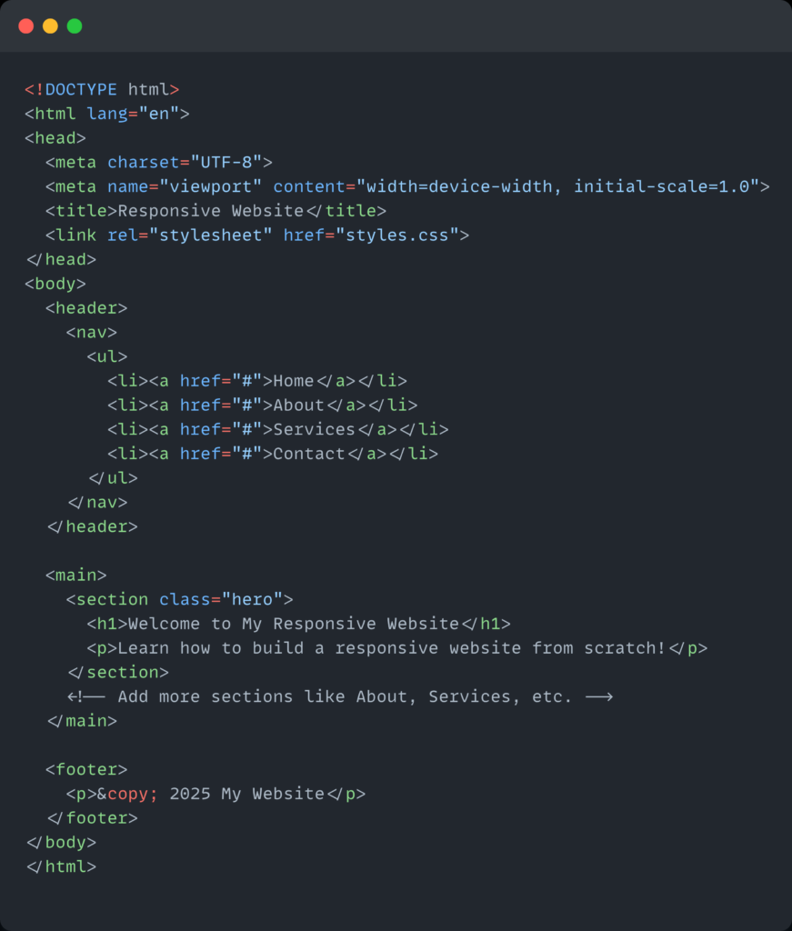
6. Writing the HTML Code for Website Design
Create your basic structure:
7. Styling with CSS for Responsiveness
Link your styles.css file and start adding basic styles:

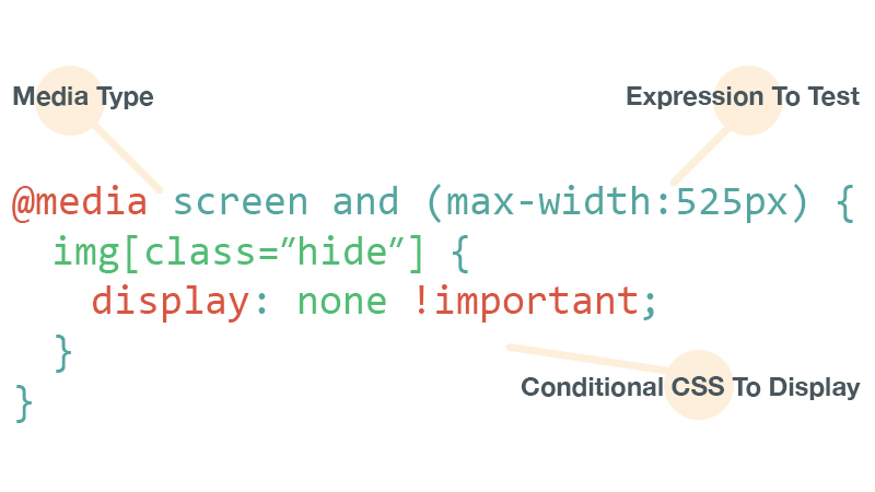
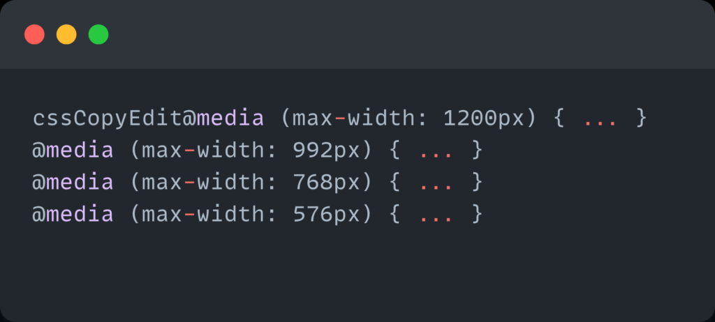
8. Media Queries and Breakpoints
This is where responsiveness shines. Use media queries to adjust layout:
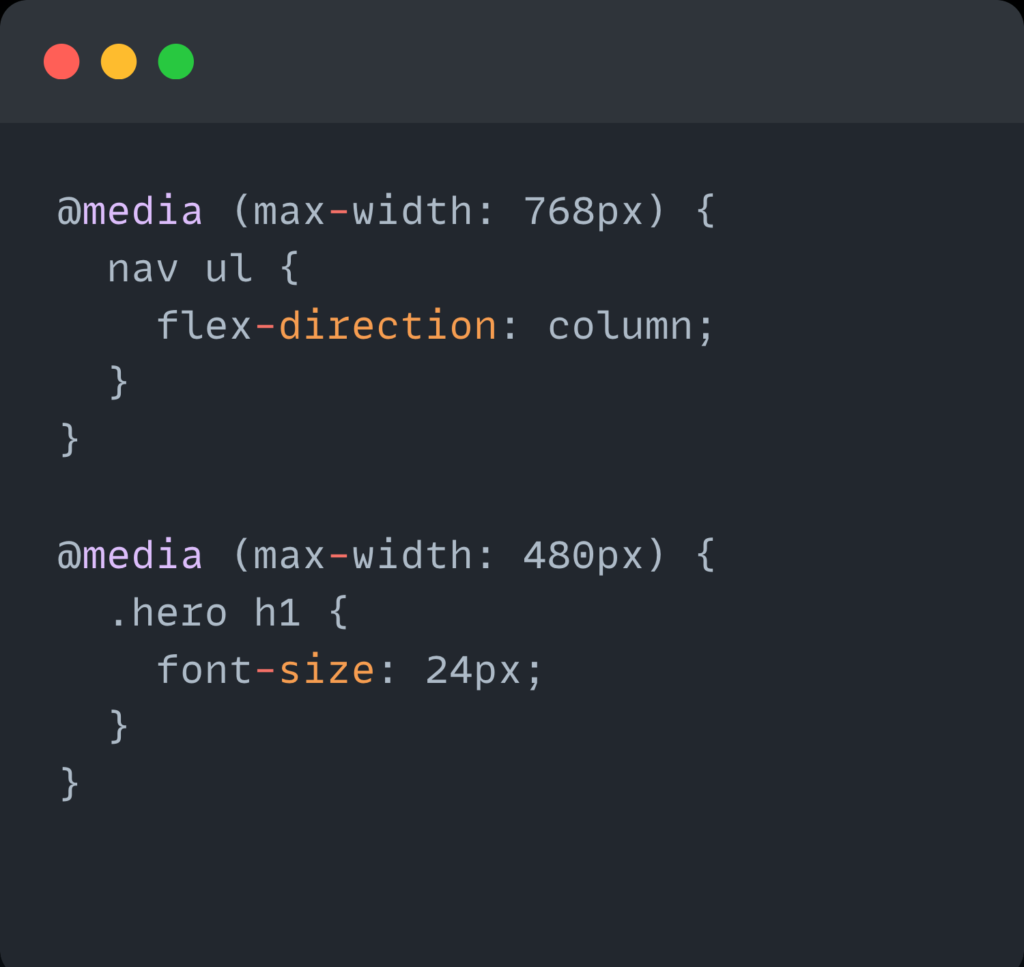
Common Breakpoints:
- 1200px (Large screens)
- 992px (Laptops)
- 768px (Tablets)
- 480px (Phones)
[Insert Image: Chart showing breakpoints and devices]
9. Responsive Images and Media
Use % or max-width: 100% for images:

Also consider using the <picture> tag or srcset for adaptive images.
10. Testing Responsiveness
Once you’ve built your website using responsive web design principles, it’s time to test your responsive website. Testing ensures that your layout, fonts, images, and interactive elements adjust perfectly across screen sizes — from desktops and laptops to tablets and smartphones.
Without proper testing, your site might look perfect on your computer but broken or unreadable on mobile — a major issue since over 60% of web traffic comes from mobile devices.
Why Testing Responsiveness is Crucial
- User Experience: A site that breaks on mobile can lose visitors fast.
- SEO Benefits: Google prioritizes mobile-friendly websites in search rankings.
- Accessibility: Proper layout ensures usability for all users and devices.
- Professionalism: A consistent look builds trust with visitors.
Testing your responsive web design is not optional — it’s a critical step in the web designing process.
Methods to Test Responsive Website Design
Here are the most effective ways to test your responsive website and make sure it performs well on all devices.
1. Resize Your Browser Window Manually
One of the simplest and quickest ways to get a sense of how your layout behaves is by manually resizing your browser window.
- Open your site in Google Chrome, Firefox, Safari, or Edge.
- Drag the edges of the window smaller and wider.
- Watch how your layout adjusts: do elements stack, shrink, or overflow?
This gives you a real-time feel of your layout’s adaptability.
2. Use Chrome DevTools Device Toolbar
Chrome DevTools comes with a powerful feature called the Device Toolbar that simulates different screen sizes and resolutions.
How to Access:
- Right-click anywhere on your webpage > Click “Inspect”
- Click the Device Toggle Icon (top-left in DevTools)
- Choose a device from the dropdown (iPhone, Pixel, iPad, etc.)
- Rotate the screen and adjust zoom
What You Can Test:
- Mobile navigation (hamburger menu)
- Font size legibility
- Tap target spacing
- Image responsiveness and scaling
- Breakpoints triggered by CSS media queries
3. Responsively App (Free & Open Source)
Responsively App is an excellent free tool that displays your site across multiple devices side-by-side in real-time. It’s perfect for developers working on responsive websites who want fast feedback.
Features:
- Simultaneous view of multiple screen sizes
- Live reload support
- Scroll synchronization
- Pre-built device presets
4. BrowserStack & CrossBrowserTesting (Cloud Testing)
If you want to test your responsive website design on real devices and across many browser versions, cloud-based platforms like BrowserStack or CrossBrowserTesting are ideal.
Benefits:
- Access to hundreds of real devices (Android, iOS, tablets, etc.)
- Test on different browsers and operating systems
- Screenshots, performance audits, and automation tools
Perfect for professionals and teams working on production-grade responsive web design projects.
5. Test on Actual Devices
No emulator beats real-world usage. Testing your site on your own mobile phone, tablet, and laptop helps you catch things that tools might miss — like tap accuracy, load speed on 4G, and how animations behave.
Test for:
- Touch responsiveness
- Image loading times
- Scrolling performance
- Font readability
Even a few minutes of live testing can make a big difference in user experience and SEO performance.
Pro Tip: Use Media Query Breakpoints While Testing
Make sure your media queries work as expected across common breakpoints:

Testing at these screen widths helps ensure your responsive web design looks great no matter what device your audience is using.
Additional Tools to Test Responsiveness
| Tool | Use Case | Free / Paid |
|---|---|---|
| Responsively App | Multi-device real-time testing | Free |
| Chrome DevTools | Mobile emulation + debugging | Free |
| BrowserStack | Real device & browser testing | Paid |
| Screenfly | Online screen size testing | Free |
| Polypane | Developer-focused browser for testing | Paid |
11. Optimizing for Performance and SEO
Creating a responsive website is only half the battle — the next step is optimizing your website for speed and SEO (Search Engine Optimization). A fast-loading, mobile-friendly, and search engine–optimized site not only improves user experience but also boosts your search rankings, traffic, and conversions.
Google has confirmed that site speed and mobile responsiveness are ranking factors.
Let’s walk through the key performance and SEO strategies you must apply to your responsive web design project.
Why Performance & SEO Matter for Responsive Web Design
- Faster websites reduce bounce rates
- SEO-optimized websites get more visibility on Google
- Mobile-first indexing rewards responsive websites
- Well-structured code is easier to maintain and scale
Whether you’re working with simple HTML code for website design or building a dynamic project with frameworks, these tips will help you go the extra mile.
1. Minify CSS, JavaScript & HTML
Minification removes unnecessary spaces, line breaks, and comments in your code to reduce file size, improving load speed.
Tools to Minify:
- Minifier.org
- Toptal Minifier
- Webpack (for JS/CSS bundling and minification)

SEO Tip: Google rewards fast-loading websites, especially on mobile.
2. Use Lazy Loading for Images
Images are often the largest assets on a webpage. Lazy loading delays loading images until they enter the user’s viewport — which speeds up initial page load.
Example in HTML:
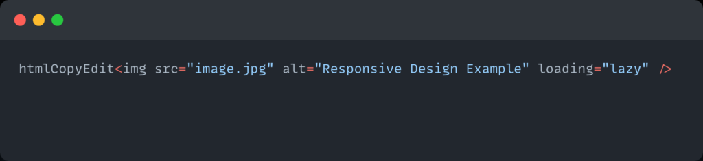
You can also use JavaScript libraries or native browser support for advanced lazy loading.
Responsive web design becomes much smoother when images don’t block content rendering.
3. Use Semantic HTML Tags
Using semantic HTML improves accessibility, structure, and SEO. It helps search engines understand the purpose of each section of your page.
Examples of Semantic Tags:
<header><nav><main><section><article><footer>
Semantic structure makes it easier for Google to crawl your HTML code for website design effectively.
4. Add Essential Meta Tags
Meta tags provide metadata about your site to search engines and browsers.
Basic Meta Tags:

- Description: Influences how your site appears on search results
- Keywords: Not a major ranking factor today, but helps with relevance
- Viewport: Enables mobile responsiveness
5. Create sitemap.xml and robots.txt
These files help search engines crawl and index your site properly.
sitemap.xml— Lists all your pages so Google can find them.robots.txt— Controls which parts of your site are crawlable.
Example Sitemap Link:

Example robots.txt:

These files improve your site’s crawlability and indexing, making your responsive website more discoverable.
6. Use Proper Heading Hierarchy (H1 > H2 > H3…)
A clear heading structure helps both users and search engines understand the flow of your content.
Example:

- Only one
<h1>per page - Use headings to break content into logical sections
Keywords like responsive web design and web designing should appear in your H1 or H2 tags where it makes sense.
7. Use Keywords Naturally in Your Content
Don’t overstuff — but be intentional.
Integrate keywords like:
- Responsive website
- Responsive web design
- HTML code for website design
- Web designing
- Responsive
Use them in:
- Page titles
- Meta descriptions
- Headings (H1, H2)
- Alt tags for images
- Anchor text in links
- First and last 100 words of the article
Avoid keyword stuffing. Google penalizes unnatural usage.
Tools for Performance & SEO Testing
| Tool | Purpose | Free / Paid |
|---|---|---|
| Google PageSpeed Insights | Performance & speed analysis | Free |
| Lighthouse (Chrome DevTools) | SEO, accessibility & best practices | Free |
| GTmetrix | In-depth performance breakdown | Free/Paid |
| Ahrefs / SEMrush | Keyword & SEO audits | Paid |
| Yoast SEO (for WordPress) | On-page SEO guidance | Free/Paid |
12. Common Mistakes to Avoid
When creating a responsive website, even small errors can lead to broken layouts, poor mobile performance, or a frustrating user experience. Whether you’re hand-coding your site or using a builder, it’s crucial to avoid these common responsive web design mistakes that can hurt your site’s functionality and SEO.
These mistakes are especially common among beginners — and fixing them early can save you hours of frustration and lost traffic down the road.
Why Avoiding These Mistakes Is Crucial
- A small design issue on mobile can cost you traffic and credibility.
- Google’s mobile-first indexing ranks sites based on mobile versions.
- A poorly coded responsive layout can increase bounce rates.
- Fixing these errors improves web designing practices and future scalability.
1. Using Fixed Widths Instead of Relative Units
Fixed widths like width: 1200px; might look fine on desktops, but they break layouts on smaller screens.
❌ Example of a fixed layout:
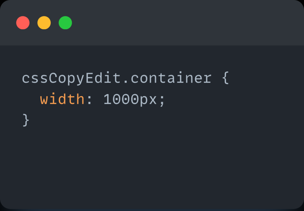
✅ Instead, use relative units:

Why it’s bad: Fixed widths force horizontal scrolling on mobile, ruining your responsive layout.
SEO Tip: A broken layout leads to poor user experience — which negatively affects your mobile SEO ranking.
2. Ignoring Mobile-First Design Principles
One of the biggest responsive web design mistakes is designing for desktop first and then trying to “fix” it for mobile later.
✅ Instead, start with mobile styles first, then scale up with media queries.
Example (Mobile-First CSS):

Mobile-first design leads to better performance, simplified code, and improved SEO with mobile indexing.
3. Not Testing Across Devices and Browsers
Just because your site looks great on your laptop doesn’t mean it’s fine on an iPhone or Android tablet.
Mistakes from not testing:
- Navigation menus not working on touch devices
- Text overlapping images
- Buttons being too small or unclickable
✅ Always test your responsive website on:
- iOS and Android devices
- Different browser engines (Chrome, Safari, Firefox)
- Desktop and tablet viewports
Use tools like Chrome DevTools, Responsively App, and BrowserStack to preview layouts across devices.
4. Overusing Media Queries Instead of Designing Flexible Layouts
Many beginners think that more media queries = better responsive design. But too many breakpoints can create messy, unmaintainable code.
Instead of over-relying on breakpoints, use flexible units and responsive containers like Flexbox and CSS Grid.
❌ Bad Approach:
✅ Better Approach:
- Use percentages for widths
- Use
min-widthbreakpoints only when necessary - Use
flex,grid, andautolayout properties
Simple, fluid layouts reduce complexity and help you build a truly responsive web design.
Bonus Mistakes to Avoid
| Mistake | Why It’s a Problem |
|---|---|
| ❌ Not setting the viewport meta tag | Your layout won’t scale on mobile devices |
| ❌ Using desktop-sized images on mobile | Slows down your page and wastes bandwidth |
| ❌ Missing ALT tags on images | Hurts SEO and accessibility |
| ❌ Inconsistent heading structure (e.g., jumping from H1 to H4) | Confuses both users and search engines |
| ❌ Lack of accessibility features (like contrast and keyboard navigation) | Excludes users and can result in legal issues |
13. Final Thoughts
Building a responsive website is both an art and a science. With the right knowledge and tools, you can create a stunning, user-friendly, and mobile-ready responsive website from scratch.
Keep learning, stay updated with modern trends in web designing, and always put the user experience first.

